Case Study II:
Poshmark (Re)Design
A UX case study dissecting and redesigning Poshmark with a focus on accessibility, personalization, clarity, and user trust
UX Design
-
Led project scoping and defined core assumptions for the redesign.
Conducted user interviews and synthesized insights into clear opportunities for improvement.
Developed personas, journey maps, and user flows to guide feature direction.
Designed low-fidelity wireframes and iterated based on usability findings.
Refined flows and interactions through multiple rounds of testing and feedback.
Presented final design rationale and delivered revised prototypes for review.
-
Figma (wireframes, UI design, prototyping)
FigJam (user flows, site map, task analysis)
Zoom (user interviews)
Adobe Photoshop (high-fidelity wireframes)
-
No access to Poshmark’s internal data or analytics, requiring reliance on observable patterns and user-reported behaviours.
Limited to external user research and public competitor insights, shaping the scope and depth of findings.
Remote user interviews reduced opportunities for contextual observation and in-person testing.
Year: 2025
Role: UX Researcher + UX / UI Designer
Timeline: 4 Weeks
A solo UX research and redesign project focused on elevating the Poshmark shopping experience. The work centred on simplifying navigation, reducing cognitive load, and introducing personalised elements to support a clearer, more efficient second-hand browsing journey.
Process + Beginning
Initial Assumptions +
Problem Framing
As both a designer and a long-time Poshmark user, I identified three core issues affecting the experience: cluttered, non-personalized feeds; difficulty tracking items; and frequent, irrelevant notifications that added unnecessary cognitive load.
User Interviews +
Empathy Mapping
I conducted three remote interviews with Poshmark buyers and sellers to examine their daily workflow. Empathy maps surfaced consistent themes: a need for efficient navigation, anxiety about missing important notifications, and confusion caused by irrelevant content suggestions.
Persona
+ Journey
Mapping
Persona
Insights from my three interviews pointed to a representative user in their 30s who frequently shops for others, comes to Poshmark with a clear target item, and prioritizes sustainability and transparent consumption.
Journey Mapping
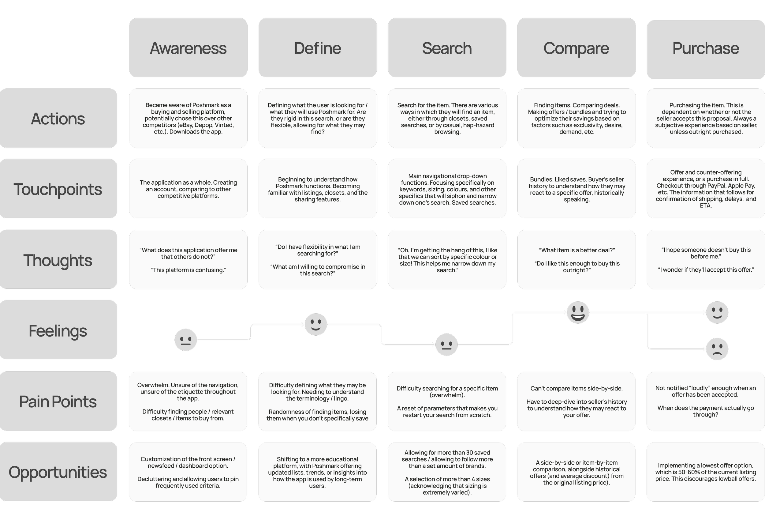
After mapping the user journey, three key pain points emerged: users frequently lost track of listings and felt overwhelmed by notification fatigue, lacked quick access to favourite sellers, and had limited insight into trending searches or personalised suggestions. These issues highlighted a clear need for stronger clarity, customization, and discovery features.
Identifying
User Flows
Low-Fidelity Wireframes
Key Features Designed
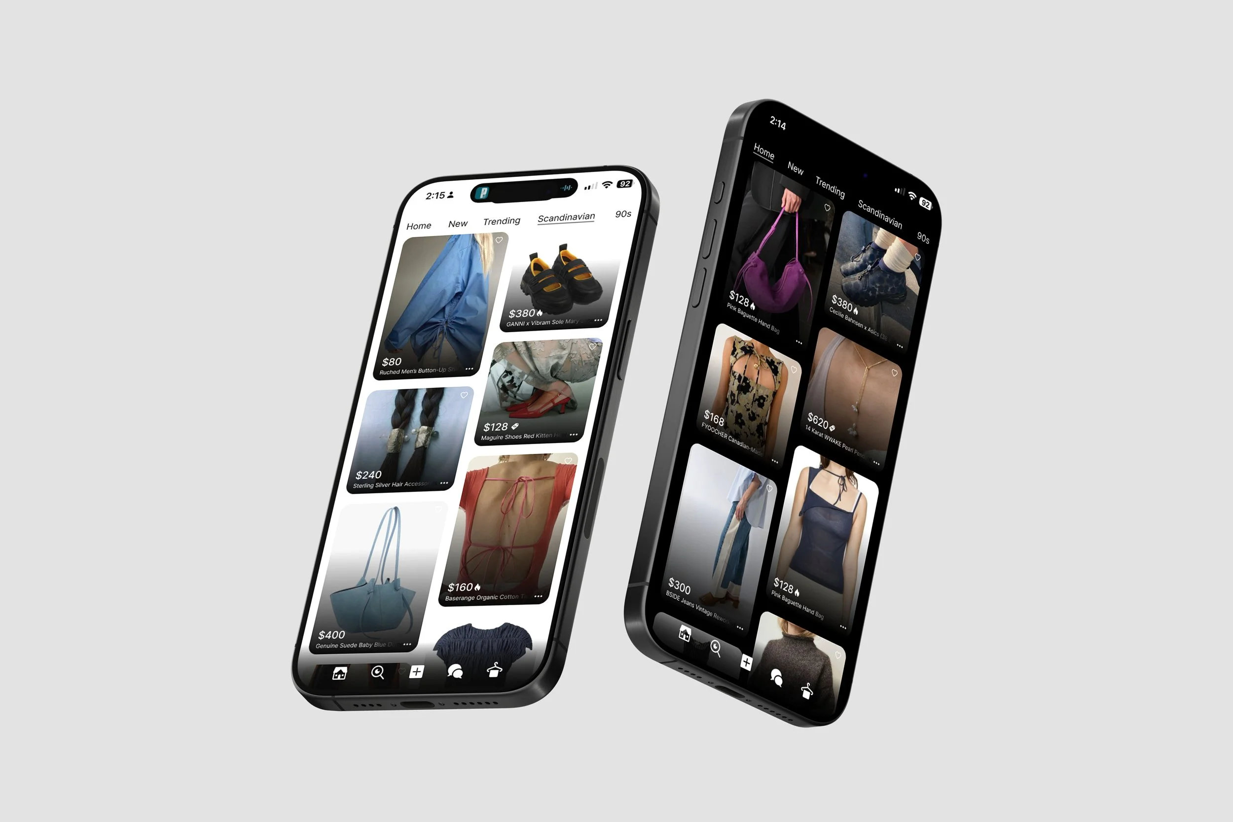
Personal Home Feed
Pinned trends, folders, and profiles create quicker access to frequent interactions and support faster recall of previous activity.
Multiple Size Profiles
Allows users to shop across different body types and desired fits, making second-hand browsing more accurate and inclusive.
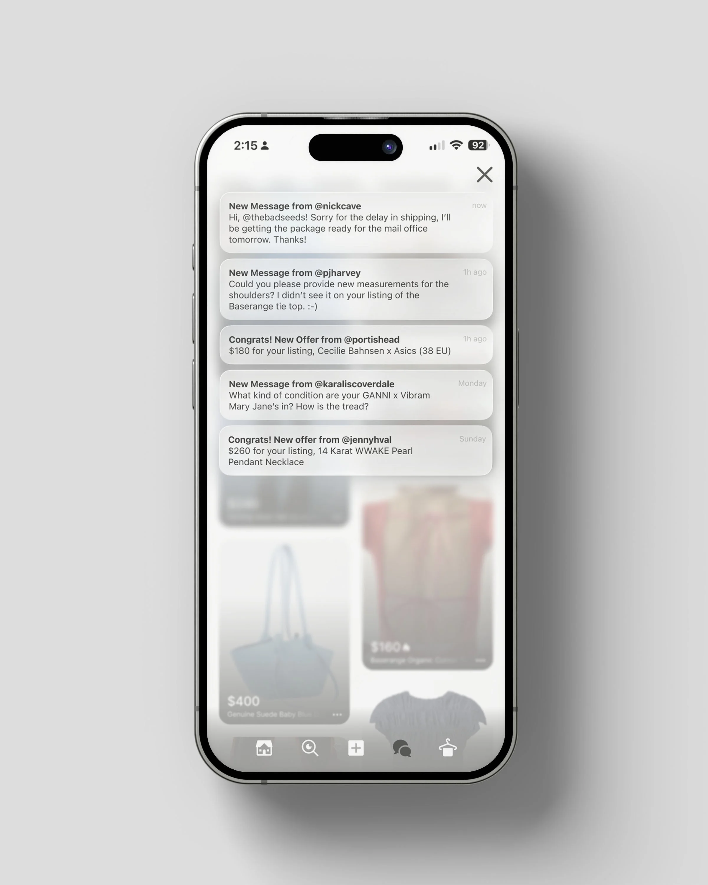
Notification Centre
Offers customised prioritisation, the ability to mute irrelevant updates, and direct messaging to sellers for clearer, more controlled communication.
Smart Listings
Surfaces transparent explanations for suggestions—trends, sellers, and items—enhanced with activity stats to support informed decision-making.
Improved Navigation + User Trust
The redesigned marketplace increased user confidence when browsing listings, navigating seller profiles, and locating past purchases. Test participants described the interface as clearer and more trustworthy, noting reduced cognitive friction and faster recognition of key pathways.
Personalization as a Driver of Adoption
Testing showed that users valued thoughtful personalization over social features. Transparent recommendations and clear system logic made the experience feel more intuitive and user-centred, reinforcing trust and engagement.
ROI: Trust, Retention + Seller Growth
By reducing overwhelm and improving relevance, the redesign supports stronger user retention and higher likelihood of repeat purchases. Increased clarity and trust position Poshmark as a more reliable resale platform—strengthening seller profitability and long-term customer loyalty.
KPIs: Performance Metrics + Behavioural Outcomes
Success was measured through key behavioural metrics: higher task-completion rates when locating items and sellers, increased use of personalized dashboard features, and fewer notification opt-outs—indicating greater relevance and reduced overwhelm.


