Case Study III:
Sprig (re)Design
A UX case study reimagining Sprig as a locally minded, sustainability-forward platform—prioritizing seasonal ingredients, seamless grocery integration, and thoughtful, user-centred planning tools
UX Design
-
As lead designer, I independently shaped the brand’s visual cohesion and identity, establishing a clear and unified design direction.
Collaboratively defined project scope and core assumptions at the outset.
Conducted user interviews and synthesized insights into clear opportunities for improvement.
Developed personas, journey maps, and user flows to guide design decisions.
Designed low-fidelity wireframes addressing key pain points and iterated based on usability findings.
Built high-fidelity wireframes that refined structure, interactions, and visual language.
Co-presented the final design rationale and deliverables.
-
Figma (wireframes, UI design, prototyping)
FigJam (user flows, site map, task analysis)
Zoom (user interviews)
Adobe Photoshop (high-fidelity wireframes)
-
Time-limited scope (6-week sprint) required tight prioritization and disciplined decision-making.
A three-person collaborative structure demanded clear communication and consistent alignment across roles.
No live user analytics were available, relying solely on qualitative feedback and usability testing.
Prototype fidelity remained mid-level, with no full UI system or development handoff.
All work needed to align with the existing brand tone and style guidelines.
User testing depended on a small peer-based pool, limiting demographic diversity and app familiarity.
Certain features—such as AI recipe generation and grocery integration—were conceptual only due to technical constraints.
Year: 2025
Role: UX Researcher + UX / UI Designer
Timeline: 4 Weeks
A UX redesign reimagining Sprig as a sustainability-driven, farm-to-table planning tool. The project centres on seasonal sourcing, eco-friendly grocery flows, and user-centred systems that encourage mindful consumption and reduce waste—creating a more cohesive, values-aligned experience.
Process + Beginning
Research +
Familiarization
To understand the existing product, we reviewed Sprig’s original app design and conducted a SWOT analysis. While the app showed strong visual cohesion, the audit revealed clear gaps in personalization, sustainability education, and meaningful user engagement.
Competitive Audit
A competitive audit of platforms such as Instacart and Lufa Farms highlighted seamless UI and UX patterns, revealing opportunities for AI-assisted planning and integrated delivery.
However, these competitors often lacked transparent sustainability practices or meaningful community impact—key gaps Sprig could uniquely address.
Persona
+ Journey
Mapping
Persona
Through competitor analysis and a review of Sprig’s style guide, our representative persona took shape as a user who prioritises sustainable, low-impact eating. She looks for plant-forward, high-protein meals, consciously sourced ingredients, and convenient grocery delivery that supports her environmental values.
Journey Mapping
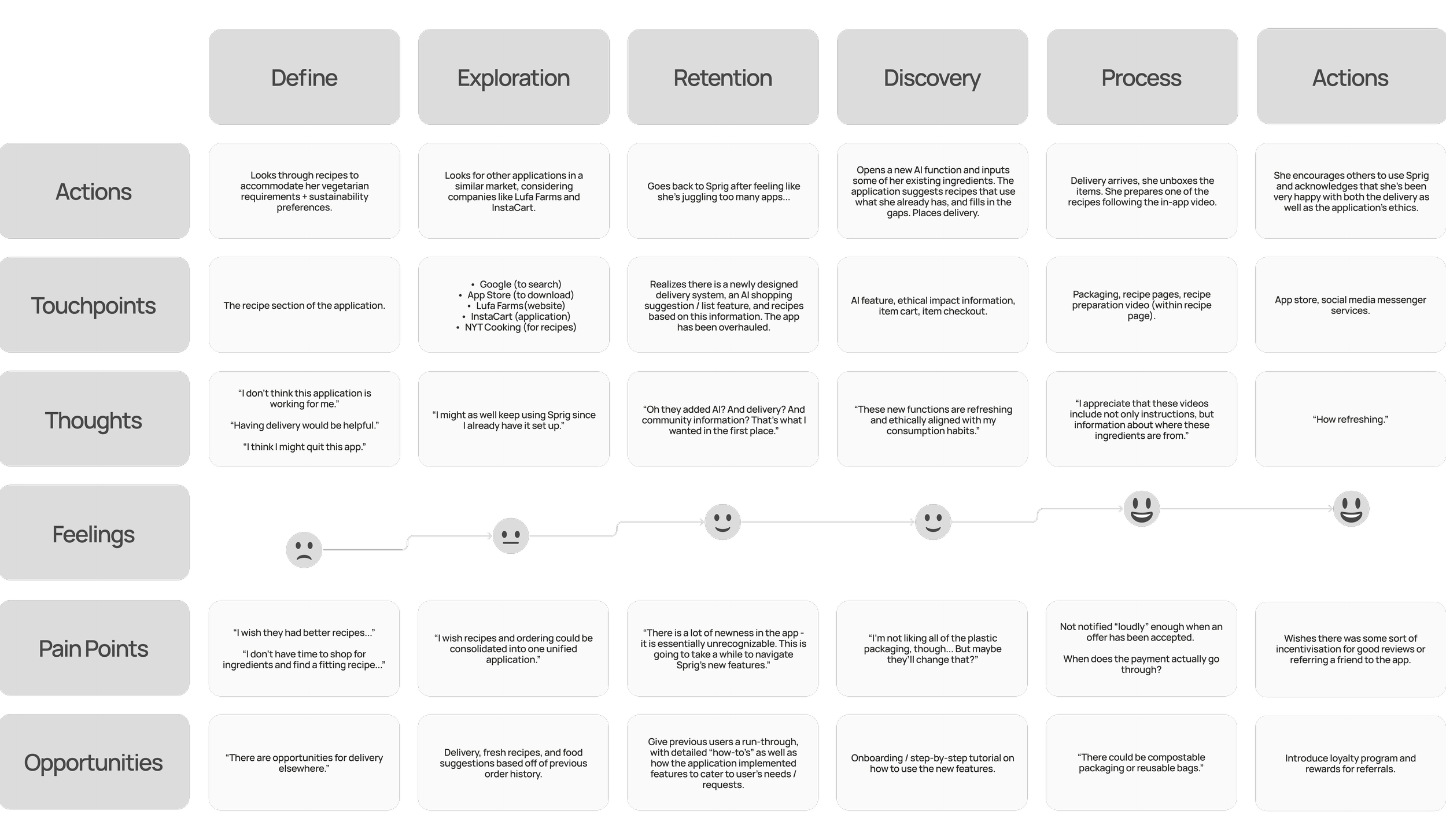
Journey mapping revealed strong initial interest in Sprig’s recipe features, but the experience lacked deeper support for sustainable practices and personalised grocery solutions. After exploring competitor apps, she returned—highlighting strong re-engagement potential if Sprig were to prioritise sustainability, clarity, and community-oriented value.
After mapping the user journey and surfacing key friction points, I redesigned core flows to prioritize sustainability, simplicity, and ease of planning.
These refinements supported clearer onboarding, personalized dietary preferences, and intuitive grocery list management—enabling users to make informed, low-waste choices while streamlining meal preparation and delivery
Key Pain Points
1. Lengthy Onboarding
The onboarding and planning flow felt slow, overwhelming, and lacked ethical clarity.
2. Limited Nutritional Needs
High-protein, plant-forward recipe options were too limited for user needs.
3. Delivery + Sustainability
The app offered no integrated delivery and provided minimal insight into local sustainability or community impact.
Design Direction:
Ethics-Driven Wireframes for Low-Waste Living
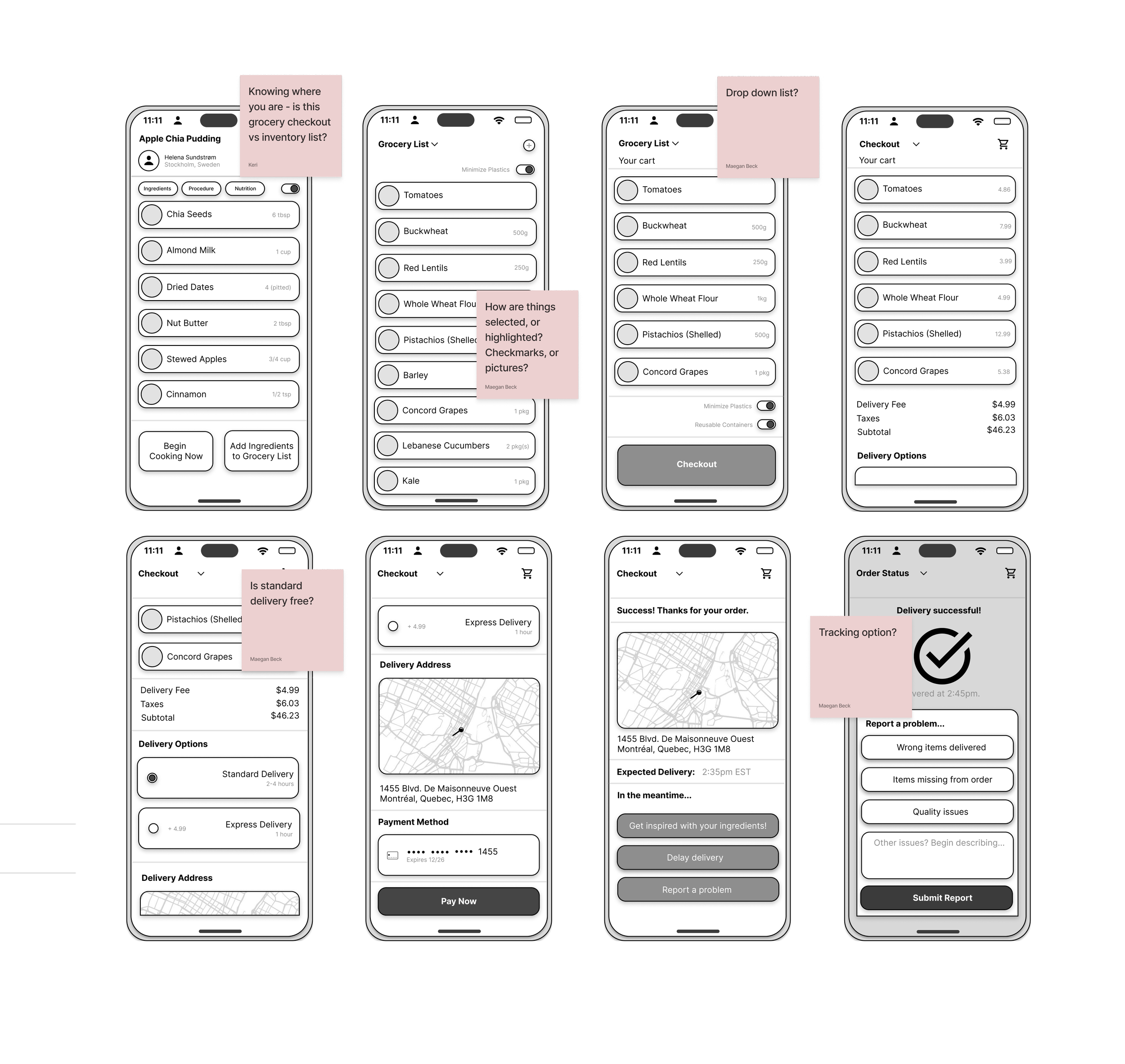
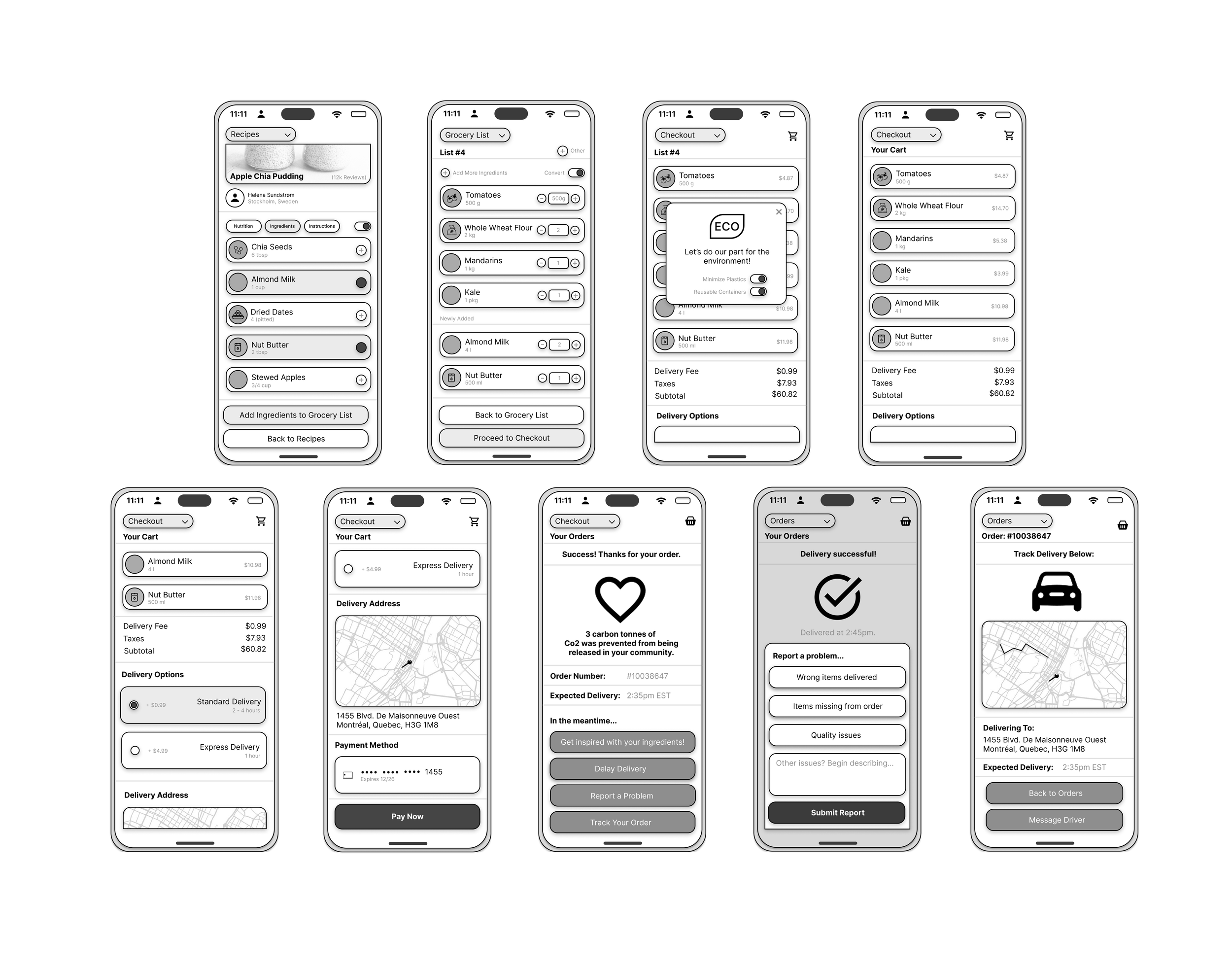
Using insights from journey mapping and persona analysis, I designed speculative wireframes that prioritized sustainability, accessibility, and low-waste living. These wireframes simplified core tasks—recipe customization, grocery planning, and delivery choices—while reinforcing ethical decision-making through clear, intuitive interactions.
Key Features Designed
Sustainable Choice Highlights
Surfaced low-waste and eco-friendly options using clear, intuitive language to support quick, values-aligned comparisons.
Add-to-List from Recipe
Enabled one-click transfer of ingredients from recipes to grocery lists, streamlining planning and preparation.
Ethical Labeling
Introduced transparent indicators for sourcing, seasonality, and environmental footprint to guide informed, sustainable choices.
Eco‑Aware Delivery Tracking
Integrated live tracking and direct driver communication, alongside CO₂ insights that help users choose lower-impact delivery options.
Bridging Inspiration + Sustainable Action
The redesigned Add-to-Grocery feature connected recipe discovery with intentional planning, allowing users to add ingredients directly from recipe pages with a single tap. This reduced cognitive effort and supported more mindful, low-waste grocery habits.
Ethical Utility + Climate-Aware Convenience
The experience centred minimalism, responsibility, and nutritional care. Portion controls, seasonal substitutions, and bulk-friendly options guided users toward sustainable choices—reframing convenience as a tool for environmental alignment rather than overconsumption.
ROI: Responsible Engagement + Waste Reduction
By making sustainable behaviour the default, the redesign strengthened Sprig’s ethical positioning and supported long-term retention. The feature increased adoption, improved platform credibility, and reinforced the app’s value as a climate-conscious planning tool.
KPIs: Values-Aligned Performance Metrics
Success was measured through higher Add-to-Grocery conversion rates, reduced planning-phase abandonment, and positive sentiment around ease and intention. Follow-up surveys showed users felt more confident shopping ethically, efficiently, and in alignment with their health and climate values.


