Case Study I:
Summit Financial Application Design

A UX case study designing Summit, a budgeting app that builds financial confidence through visual clarity and guided goal setting
UX Design
Year: 2025
Role: UX Researcher + Designer
Timeline: 4 Weeks
-
Led user research and competitive analysis to uncover pain points and identify product gaps.
Defined and developed the app’s visual identity, integrating the hiking metaphor into brand language and interface design.
Designed high-fidelity prototypes for onboarding, goal-editing, and money-transfer flows.
Wrote friendly, persuasive UX copy and developed interface animations for the virtual assistant, Scout.
Directed post-user-testing revisions, streamlining information architecture and enhancing clarity.
Synthesized usability findings and implemented user feedback into final prototypes for hand-off.
-
Figma (UI design + prototyping)
FigJam (user flows, site-map + task-analysis)
Zoom (remote user interviews)
Adobe Photoshop (image refinement)
AI-Assisted Image Generation (ChatGPT)
-
Navigated the tension between a playful metaphor and the need for financial clarity and trust.
Small testing sample (5 participants) limited the scope of iteration.
Mobile-first constraints required deliberate layout and content prioritization.
Financially sensitive content required precise, reassuring language.
A UX Research + Design project for Summit, a budgeting app by HorizonBank. Designed for emerging earners, it helps users set clear goals, track progress visually, and build confidence via an intuitive hiking-metaphor experience.
Process + Beginning
Context + App’s Framing
A mobile app for HorizonBank customers, helping build financial confidence via goal tracking, simple savings flows, and a virtual assistant — all framed through a financial “ascent”.
Problem Statement
First-time budgeters often find financial tools jargon-heavy and overwhelming. Summit tackles that by offering clear visualizations, emotionally resonant metaphors, and a guided, approachable experience.
Research
+ Users
Research +
Competitor Analysis
We reviewed apps such as Buddy, TD MySpend, and Tangerine. We found visuals were often clunky, data overwhelming, emotional support lacking, and onboarding weak.
Users + Audience
Summit targets 20-35-year-old first-time budgeters who seek confidence in money management, emotional support, intuitive guidance, and visual feedback in their financial tools.
-
![]()
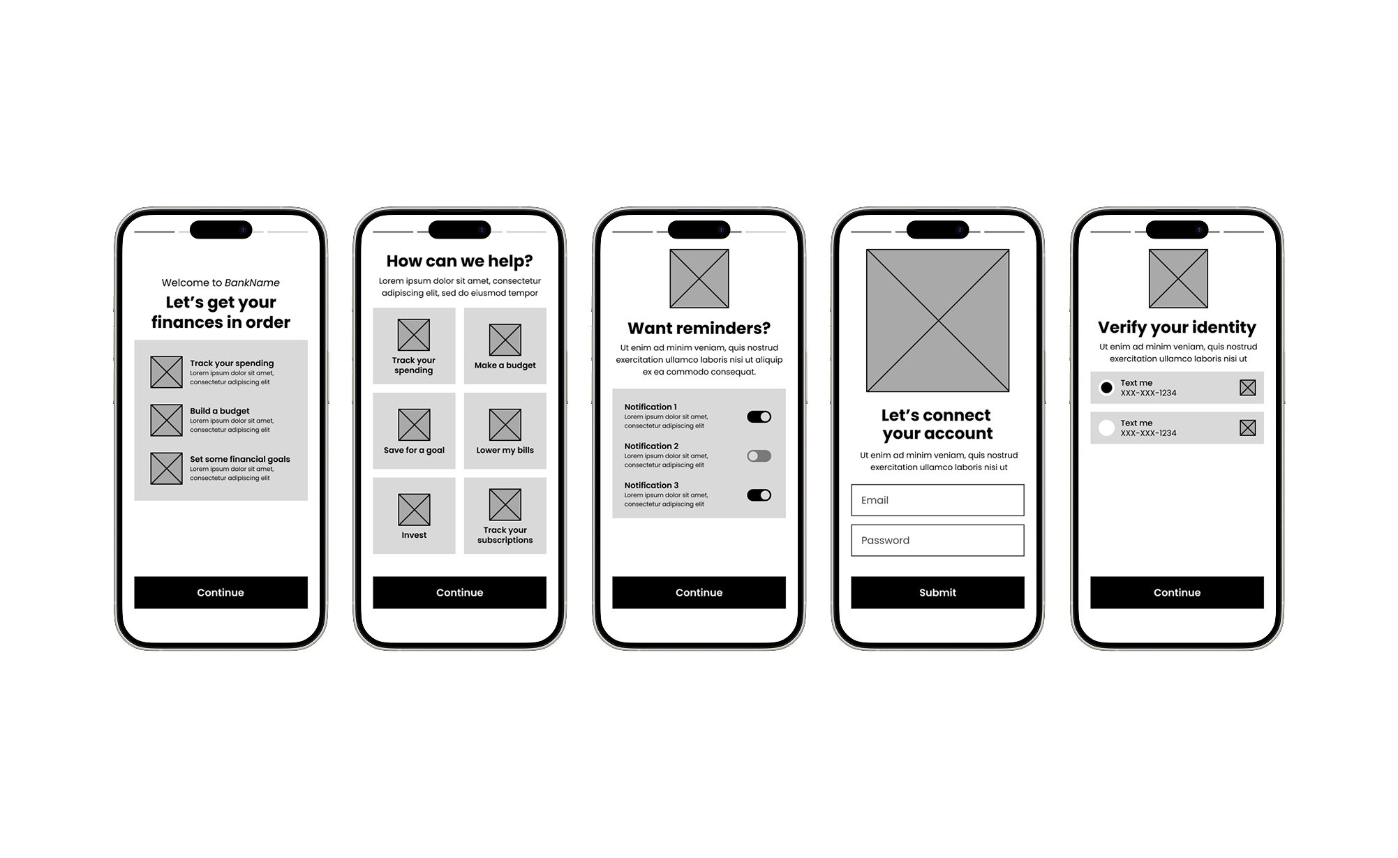
Wireframes: First Onboarding Iteration
First concepts of Scout, the virtual assistant.
-
![]()
Wireframes: Before User Testing
Further developed high-fidelity wireframes, before user testing.
-
![]()
Wireframes: User Testing Issues
Where users encountered friction, or confusion.


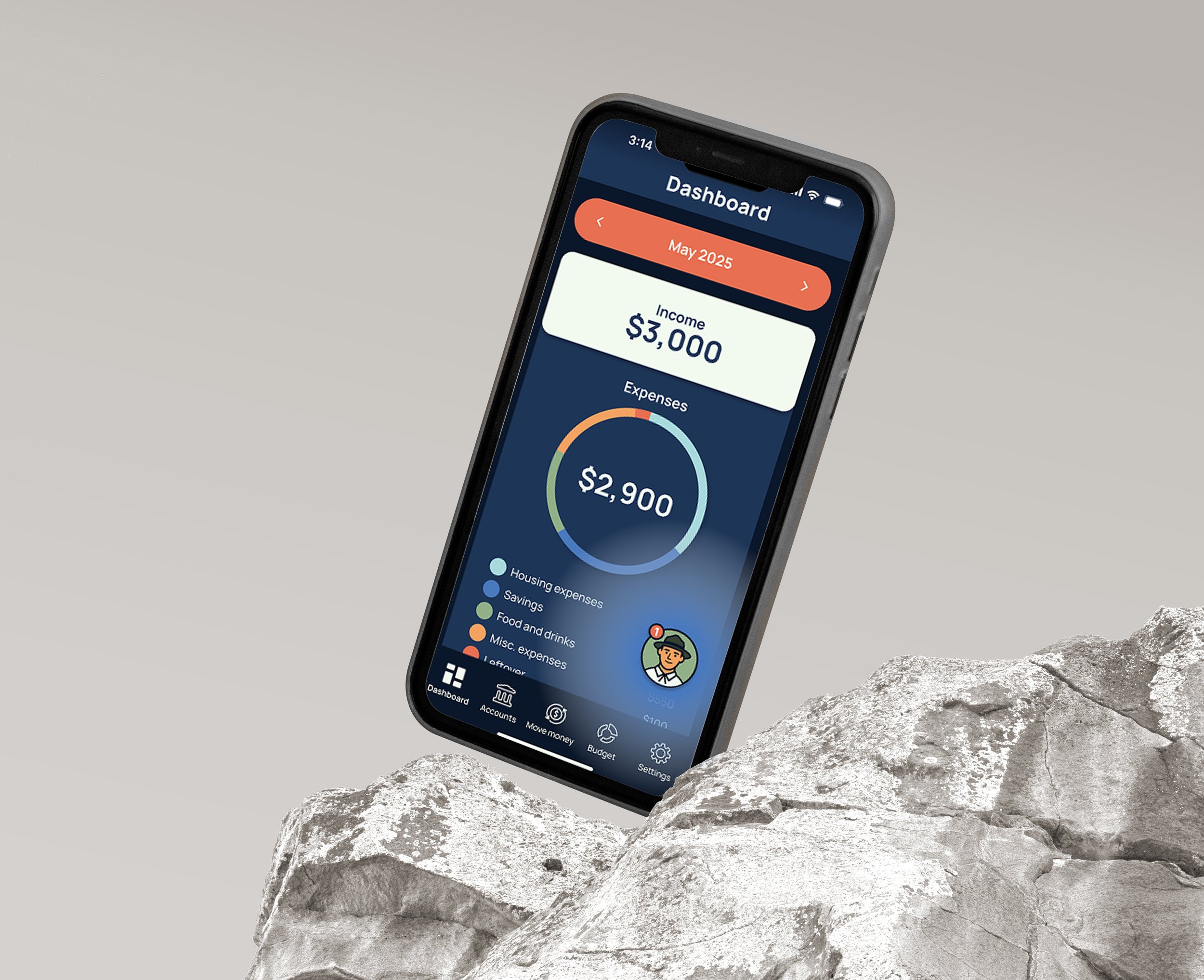
A Visual Ascent
Using a hiking metaphor, Summit reframes budgeting as a journey of steady progress instead of restriction.
Goal badges, trail markers and elevation-style graphs visualize the “ascent” to financial milestones and boost motivation through clear, achievable steps.
Key Features Designed
Onboarding Flow
Designed a badge-style onboarding flow with simplified steps and skip options to ease new users in.
Brand Language + Tone
Crafted clear, encouraging UX copy that aligns with Summit’s motivational tone.
Scout Integration
Refined Scout using contextual prompts and subtle animations—supportive without being overwhelming.
Visual Identity Design
Created a calm, trust-driven interface, with earthy tones, soft shadows and rounded components.
Increased User Confidence
The redesign increased user confidence and reduced confusion in goal setup and money transfers. Participants praised clearer navigation, streamlined onboarding and a more helpful, less intrusive Scout.
Importance of Simplicity
Simplification, tone and pacing were crucial, especially for users experiencing financial stress. Subtle support and a friendly, clear structure outperformed dense instructions and heavy gamification. Next steps: earlier testing with diverse financial backgrounds to strengthen accessibility and trust.
ROI: Building Trust + Loyalty
Trust and long-term retention improved when the experience prioritized simplicity, clear pacing, and supportive guidance. Subtle prompts outperformed dense instructions or gamification, driving higher user confidence early in the journey. Future iterations will include earlier testing with diverse financial backgrounds to strengthen accessibility and sustain engagement.
KPIs: Tracking Success
We measured onboarding completion (targeting 75%+), goal creation and interactions with Scout. Higher weekly check-ins and prompt engagement indicated stronger user connection, confidence and growth.