Case Study II:
Freshly Chopped (re)Design
UX DESIGN

A UX case study redesigning Freshly Chopped with a focus on personalization, seamless grocery integration, and sustainable user-centred features
-
Collaboratively defined scope + assumptions
Conducted user interviews + synthesized findings
Developed personas, journey maps, + user flows
Designed low fidelity wireframes to address pain points
Iterated based on usability insights, developing high-fidelity wireframes
Co-presented final design rationale
-
Figma (wireframes, UI design, prototyping)
FigJam (user flows, site map, task analysis)
Zoom (user interviews)
-
Time-limited scope: 6-week sprint with fixed deadlines
Team dynamics: Collaborative 3-person team with divided responsibilities, requiring consistent alignment
No live user analytics: Relied solely on qualitative feedback and user testing (no in-app data)
Prototype fidelity: Final designs limited to mid-fidelity—no full UI system or dev handoff
Content limitations: Had to work within the existing brand tone and style guide
User access: Limited testing pool; relied on peer testers + assumed familiarity with recipe apps
Tech feasibility: Certain features (e.g. AI recipe generator, grocery integration) were conceptual only
Year: 2025
Role: UX Researcher + Designer
Timeline: 6 Weeks
A collaborative UX redesign focused on transforming Freshly Chopped into a personalized meal-planning and grocery delivery app. The project introduced dietary customization, improved onboarding, and integrated sustainability-focused grocery flows to create a cohesive, health-conscious user experience.
Process + Beginning
1.
Research & Familiarization
Working with a previously designed application, we conducted a SWOT analysis—revealing strength in visual appeal, but gaps in personalization.
2.
Competitive Audit
Competitor analysis (e.g. InstaCart, HelloFresh, Lufa Farms) inspired seamless UI + UX patterns, pointing to opportunities for AI-assisted planning and integrated delivery. However, they often lacked recipes.
3.
Persona
After competitive analysis and evaluating the application’s style guide, our representative persona—Brenda—emerged as someone who is:
I. Focused on health-conscious, vegetarian, and high-protein meals
III. Looking for convenience through curated grocery delivery
IV. Motivated by sustainability
Persona
+ Journey
Mapping
4.
Journey Mapping
As an early adopter, Brenda appreciated the recipe features but was frustrated by the lack of personalization and grocery delivery. She left the app, tried competitors, and eventually returned—revealing strong re-engagement potential if Freshly Chopped prioritized clarity, customization, and convenience.

Key Pain
Points
Time Investment
Onboarding and planning felt slow and overwhelming
1
Nutritional Needs
Limited options for vegetarian or high-protein filters
2
Delivery + Sustainability
No integrated delivery or eco-conscious options
3
After identifying key pain points through persona development and journey mapping, we translated those insights into speculative wireframes focused on clarity, efficiency, and personalization.
These wireframes address core tasks—like recipe planning, dietary filtering, and grocery delivery—to support users’ health goals while minimizing cognitive load and time investment. In this case study, I will highlight the design development of Freshly Chopped’s delivery feature.
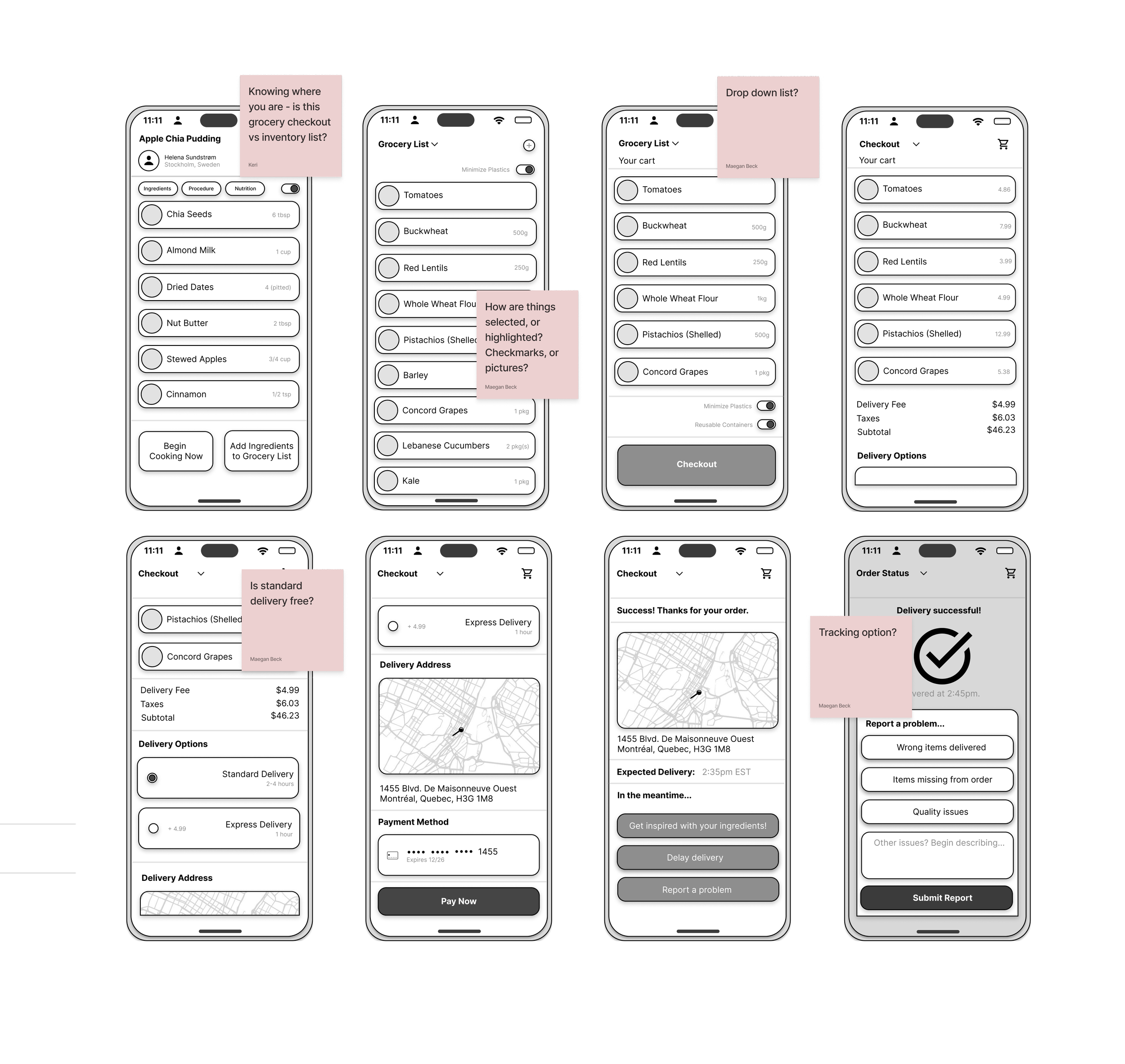
5. Wireframes
-
![]()
Initial Delivery Wireframes
First iteration.
-
![]()
User Testing Issues
Issues in user testing.
-
![]()
Final Revised Wireframes
Revised after user testing + identifying pain points.

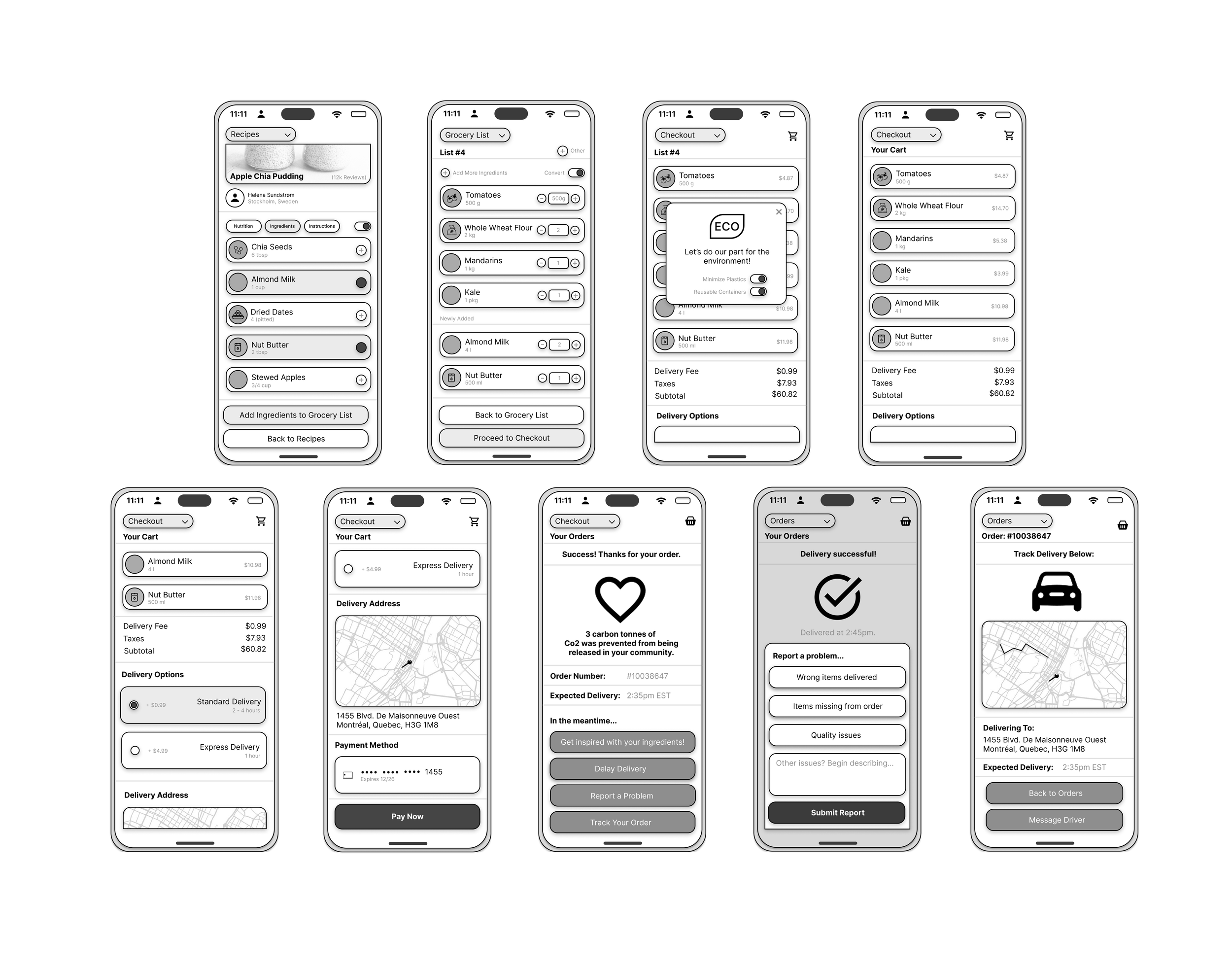
Four Revised Features
Added Sustainability Toggles
Let users choose eco-friendly options like reusable containers.
1
2
Clearer Dropdowns
Simplified language and structure for easier grocery selection.
3
Add-to-Grocery from Recipe
Enabled one-click item transfer from recipes to grocery lists—streamlining planning and prep
4
Delivery Tracking
Ability to directly message driver + get real-time updates through built in messaging feature
Introducing the "Add-to-Grocery" feature directly from recipe pages significantly streamlined user interaction, reducing friction between meal planning and ingredient acquisition. Usability testing revealed that users felt more confident navigating the application, and were more likely to complete recipe flows when ingredients could be added with a single tap. This not only improved perceived app utility, but also strengthened user trust in Freshly Chopped as a one-stop solution.
7. Outcomes + Lessons
From a business standpoint, this feature increased engagement with both recipe content and grocery functions—doubling recipe-to-grocery conversions during testing sessions. Key KPIs impacted included higher grocery list creation rates, increased time on task, and a measurable drop in user drop-off between recipe browsing and grocery checkout.

