Case Study I:
Poshmark (Re)design
UX DESIGN

A UX case study redesigning Poshmark with a focus on accessibility, clarity, and user trust
-
Defined scope + assumptions
Conducted user interviews + synthesized findings
Developed personas, journey maps, + user flows
Designed low-fidelity wireframes
Iterated based on usability insights
Presented final design rationale
-
Figma (wireframes, UI design, prototyping)
FigJam (user flows, site map, task analysis)
Zoom (user interviews)
Adobe Photoshop (high-fidelity wireframes)
-
No access to Poshmark’s internal data or analytics
Limited to external user research + public competitor insights
Remote user interviews
Year: 2025
Role: UX Researcher + Designer
Timeline: 4 Weeks
A solo UX research and redesign project focused on improving user experience within Poshmark, a social second-hand marketplace app. The project aimed to streamline navigation, reduce cognitive overload, and introduce personalization features for a more intuitive and efficient shopping journey.
Process + Beginning
2.
User Interviews + Empathy Mapping
I interviewed 3 users remotely (buyers + sellers) to validate pain points. Empathy maps highlighted:
I. Desire for efficiency + clarity
II. Anxiety around missing purchases
III. Frustration with content suggestions
1.
Initial Assumptions + Problem Framing
I hypothesized that users were overwhelmed by non-personalized content, struggled with tracking items, and were frustrated by irrelevant notifications.
3.
Persona
After my three interviews, my representative “persona” was someone who is:
Often additionally shops for others
Comes to Poshmark with a specific item or object to buy in mind
Is 30 years old + values sustainability and transparency
Persona +Journey Mapping
4.
Journey Mapping
After mapping my persona’s journey map, there became three clear pain points while using the application:
Frequent lost listings + notification fatigue
No quick access to favourite sellers
No statistics on trending searches or suggested items

After identifying key friction points through user journey mapping, I translated those insights into new user flows that emphasized clarity, customization, and trust. These flows restructured core interactions—such as item discovery, notification management, and profile personalization—laying the foundation for wireframes that addressed user goals with greater precision and ease.
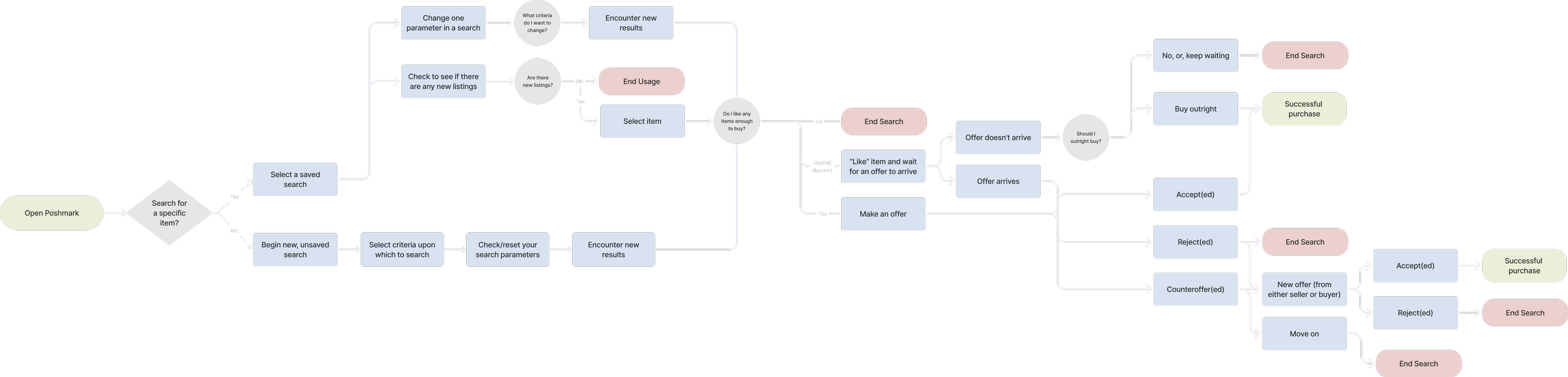
5. User Flows
-
![]()
Original Application Flow
Original Poshmark user flow.
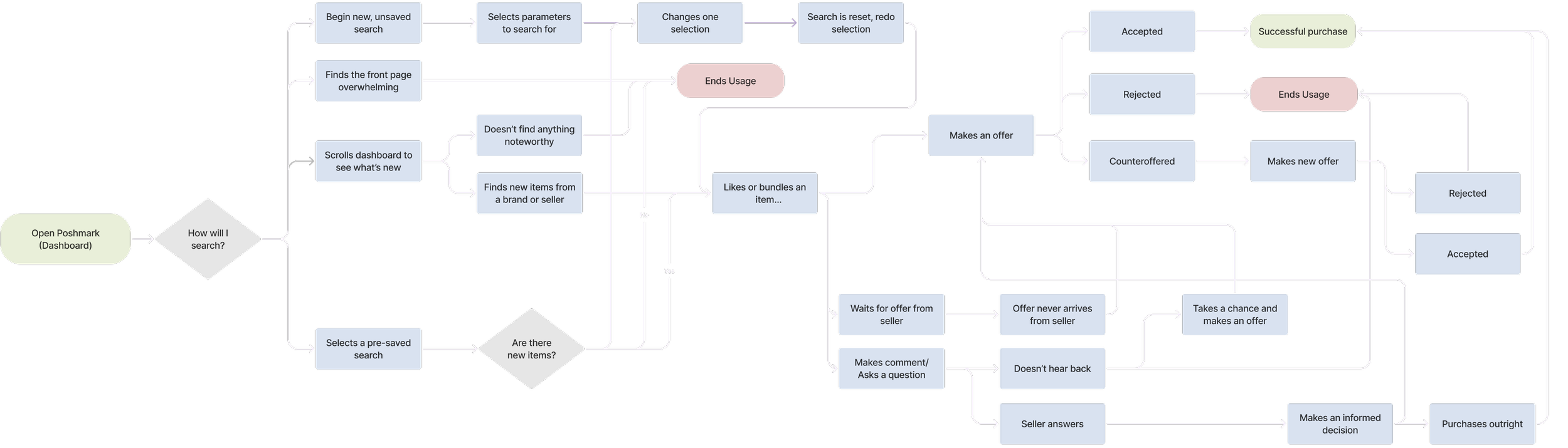
-
![]()
Revised User Flow
User flow with implemented suggestions.
-
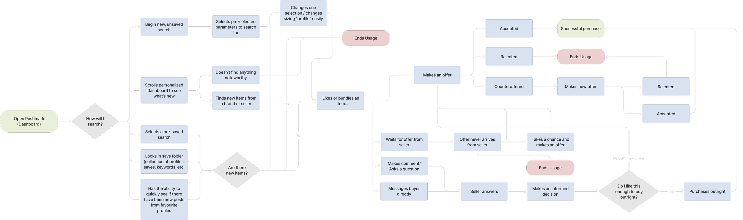
![]()
Final User Flow
Revised after user testing + identifying pain points.
6. Low Fidelity Wireframes
After identifying user frictions, I created low-fidelity wireframes to test layout structure, interaction clarity, and feature prioritization. These intitial wireframes were speculative in nature, focusing on redesigning the home feed, notification centre, and customizable dashboard. This allowed me to explore how users might pin sellers, mute irrelevant alerts, and navigate personalized content flows more intuitively.

Key Features Designed
Personal
Home Feed
Pin trends, folders, profiles for easier access + faster recall of previous interactions
1
Multiple Size
Profiles
For shopping for various bodies + desired fit
2
Notification Center
Customized prioritization, mute irrelevant updates, message sellers directly
3
Smart Listings
Explain suggestions (trends, sellers, items) with activity stats + more information
4
The redesigned experience led to noticeably improved user confidence and ease of navigation. Participants reported reduced friction when locating past items or sellers, and responded positively to the new personalization dashboard. Notifications, previously seen as overwhelming, became far more manageable and relevant post-redesign.
Key takeaways included the importance of customization and clarity—proving just as vital as visual polish. Users favoured subtle, intentional control over hyper-social features, and valued transparency around suggestions and system behaviour. In future iterations, I would prioritize earlier prototyping and test with a broader range of users to better evaluate onboarding and accessibility from the start.

